Miseno Fine Jewelry
Role
Lead Designer+ Art Director
Team
Agency: Kraftworks CD: Neil Kraft
Senior AD: Karen Lee
Photographer: Kanji Ishii

Challenge
Miseno Fine Jewelry needed a sleek, modern rebrand that communicated the quality of their vibrant jewelry and could reach a discerning audience. The jewelry designer is inspired by organic forms of the beach, ocean, and historic town of Napoli, Italy — especially its ancient Roman arch, “arco felice.” Extensive research into the fine jewelry market clarified the need to elevate all aspects of the brand, with unified color and typography.
Visual Identity + Art Direction Exploration


Initially, the complexity of the jewelry inspired curving, repeating, marine life-inspired designs. These concepts were then distilled down to the most elegant, modern and minimal iterations for the most premium feel possible, while still nodding to the designer’s unique creative ties to Napoli. The final logo is a minimal, elevated take on the ancient “arco felice.”
Logo Concepts + Iternations


This minimalist take on the beach plays with the positive and negative spaces in the designs of pieces, accentuating their forms. Sandy backgrounds ranging from white to beige to deep grays differentiate collections. The product is the hero, using patterns in the sand to highlight the details of each piece.
Final Art Direction
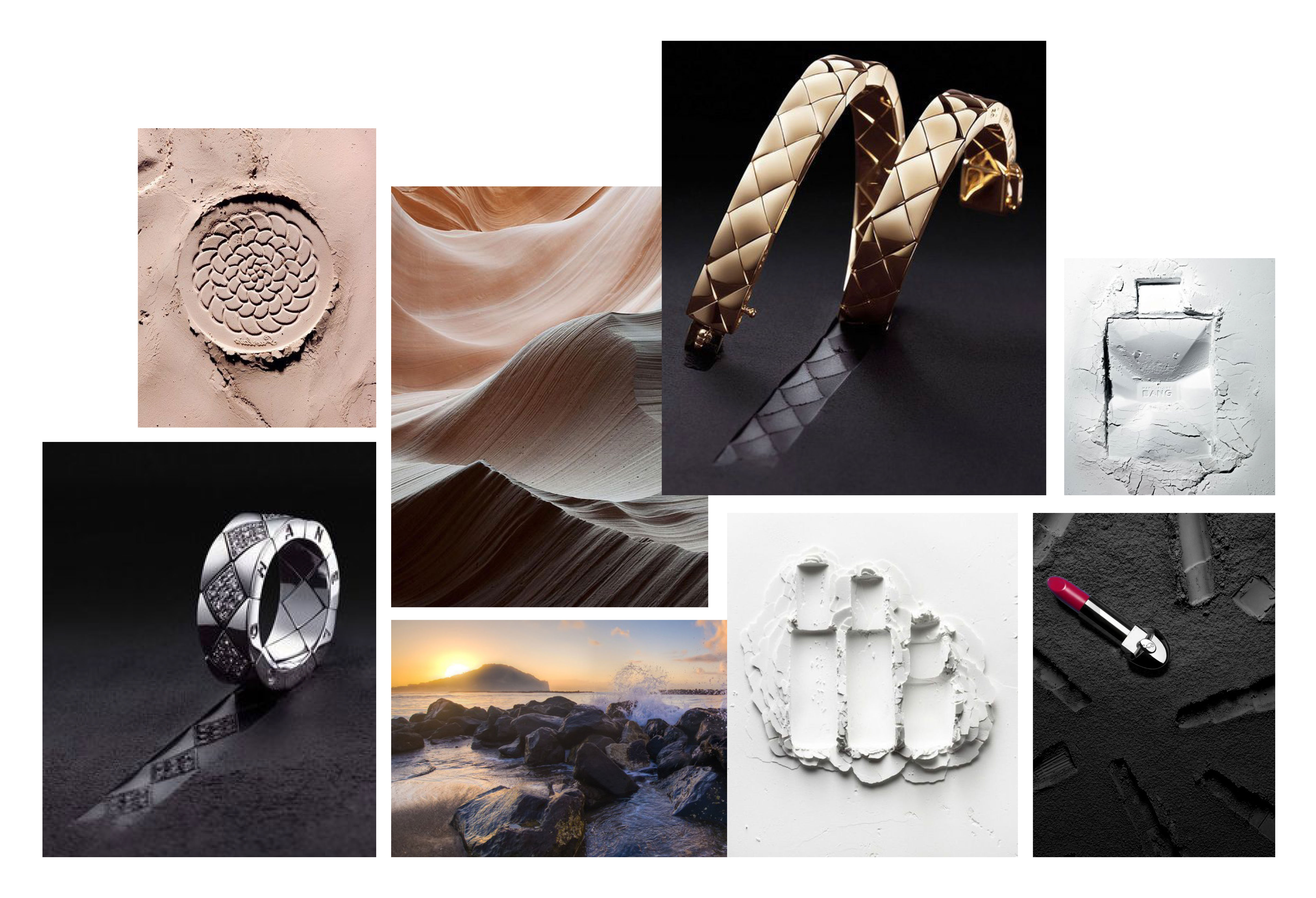
Dark gray and warm neutrals were selected to stand out from competitors relying on classic black & white or bright signature colors. This both showcased Miseno’s dazzling new gold and diamond line, and allowed the brightly-colored gemstones in other collections to shine.
In addition to the new visual identity, photography, and website, an oversize print booklet was created to leave a lasting impression at their upcoming tradeshow debut.
Marketing Collateral


Result
The new visual identity, art direction, and memorable collateral ultimately established their reputation in the American market and catapulted the brand into Saks Fifth Avenue.
Website

