LouLou L.Ac
Role
Creative Director Packaging
Challenge
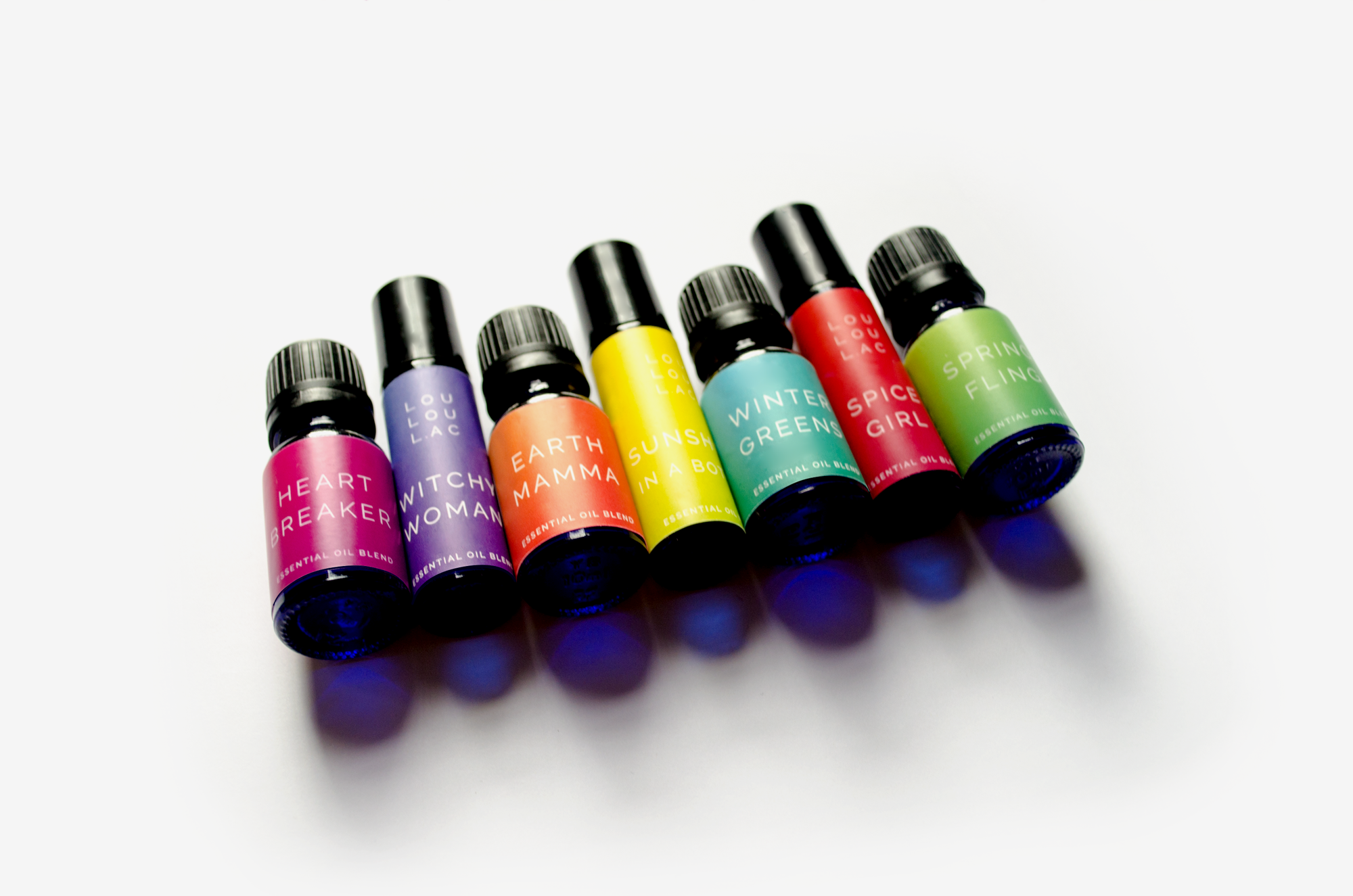
Seeing the growing popularity of essential oils, LouLou developed her own line of blends based on her experience with clients as an acupuncturist and expertise in traditional Chinese medicine.
With growing competition in the market, she needed a visual edge to stand above the competition, whether at a market booth or on a boutique shelf. Her visual identity had reflect her bright, effervescent personality and stand out from pastel, wishy-washy “wellness” trends.

“One of the main things I hear all the time about my products is how pretty they are.
The beautiful design and colorful labels make the products stand out in an oversaturated market.
Working with Sharon made it easy and fun to expand the line. We were on the same page and shared the same vision.”
The beautiful design and colorful labels make the products stand out in an oversaturated market.
Working with Sharon made it easy and fun to expand the line. We were on the same page and shared the same vision.”
—LouLou Piscatore, L.Ac.
Result
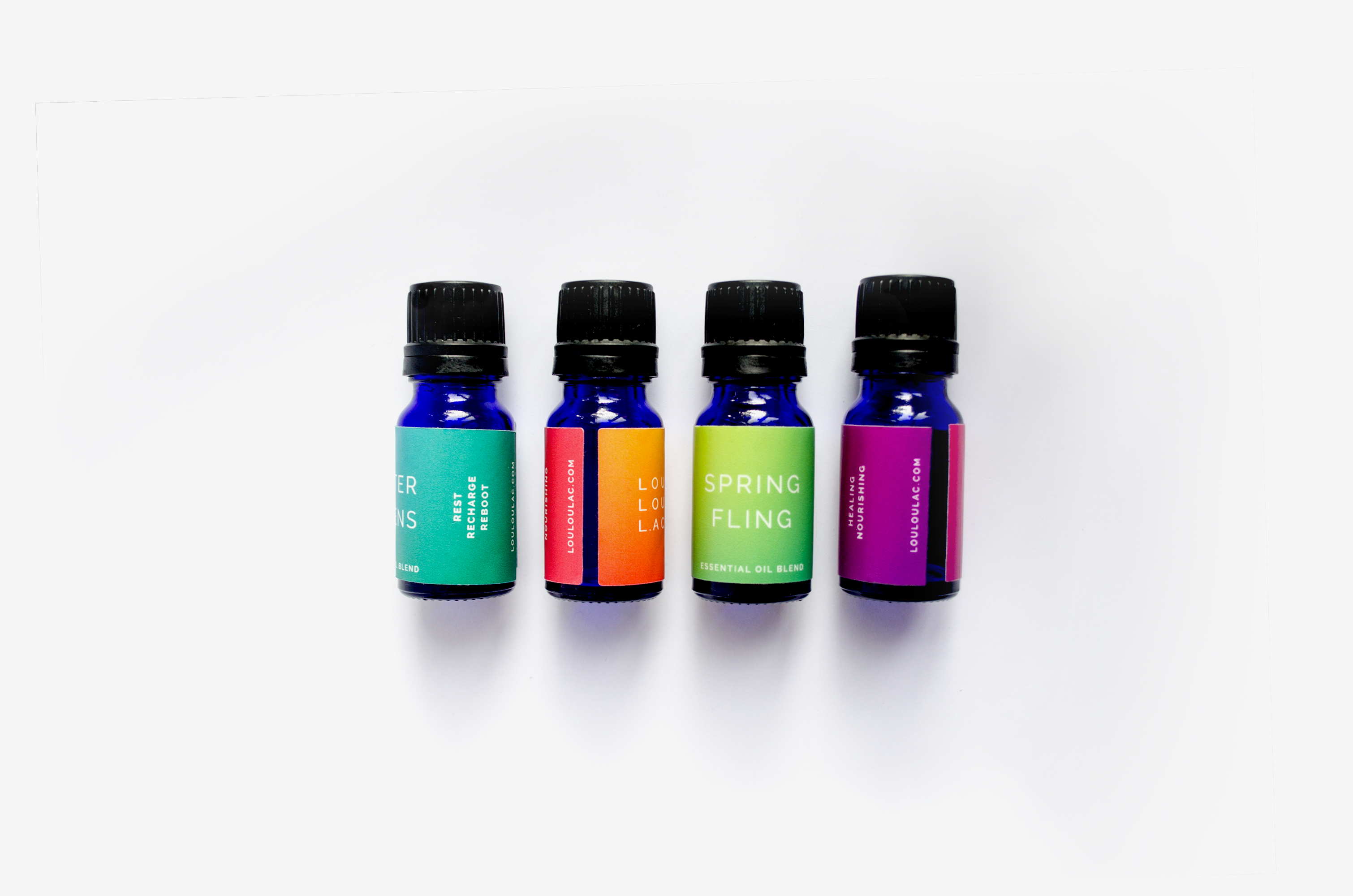
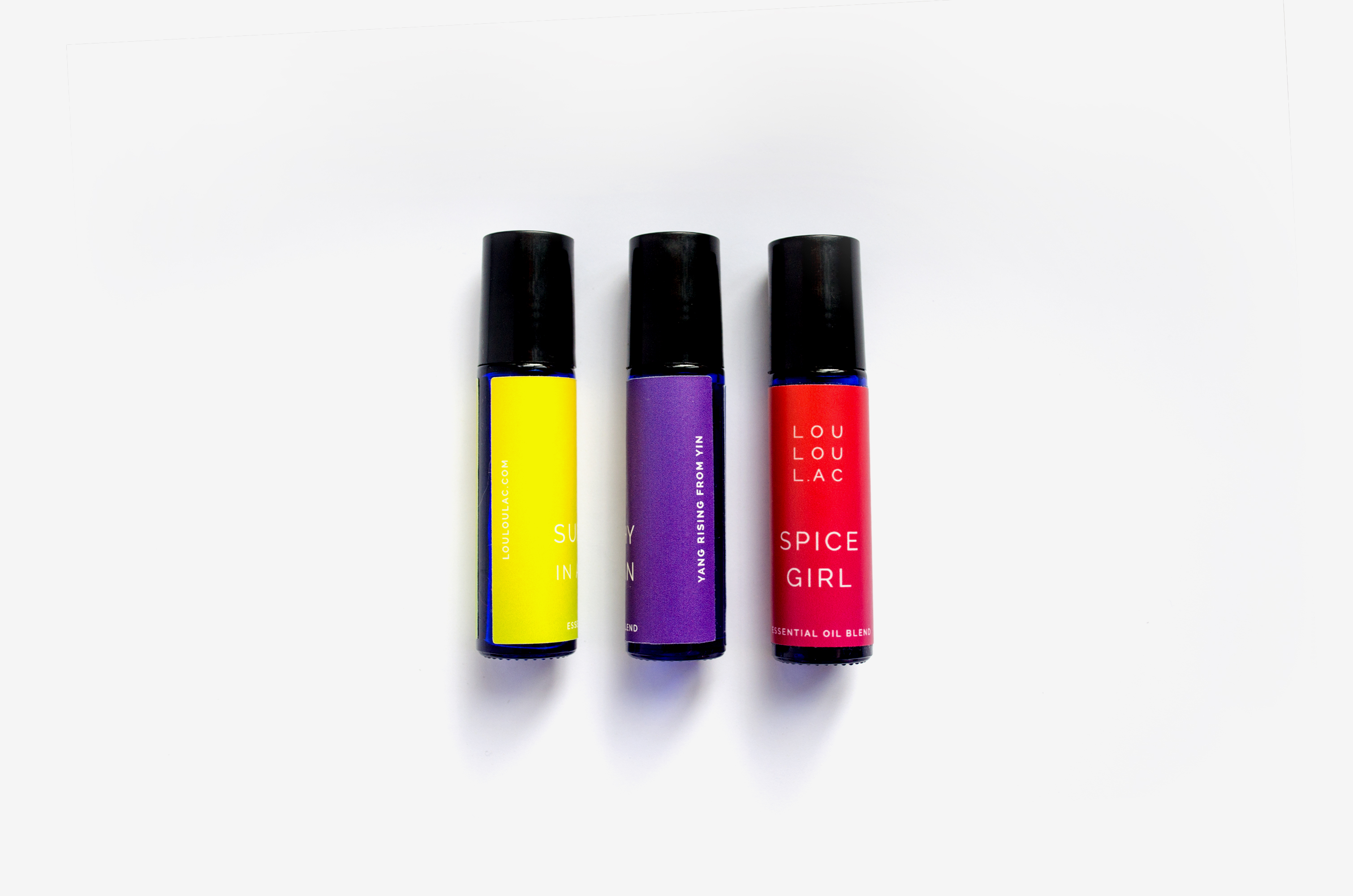
We chose to use a clean, minimal and modern logo and typographic style against super-saturated gradient backgrounds. This maintains a sense of serene simplicity and immediately communicates the energetic effects of the oils — without a chance of blending into the crowd. This also opened an obvious avenue to expand the line by adding
new gradients.
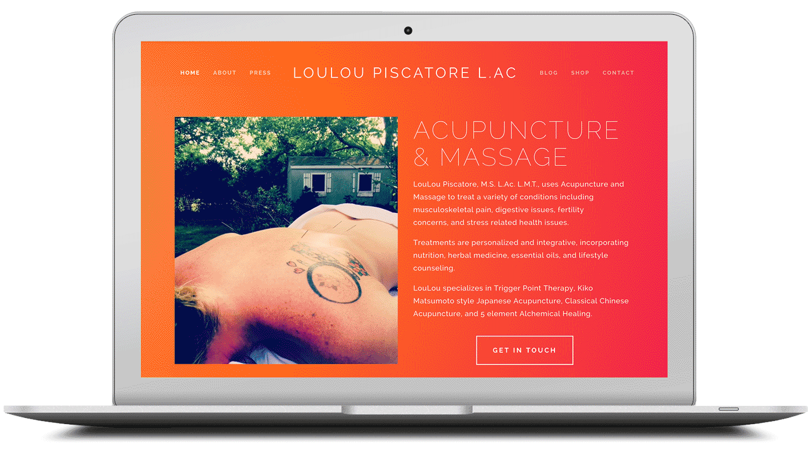
In addition to the bold product labels, her website was designed to seamlessly integrate the colorful backgrounds and elegant typography into a fully immersive experience. Eventually, the line of seasonal essential oils expanded into a full range of products for bath, body, beard and scalp.
Website