Laura Thompson Photography
Laura’s bright, clever portrait and food photography is as fun and bold as her personality. As her business grew and she had more self-promotional needs, she needed a more unified base to build her materials on.
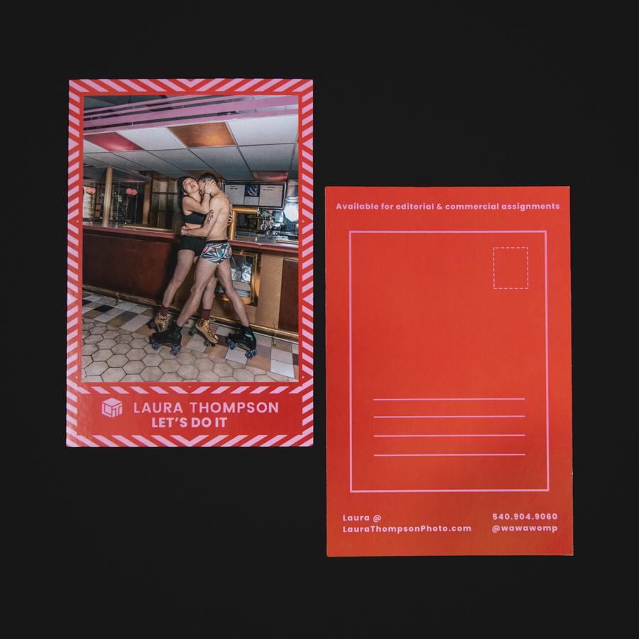
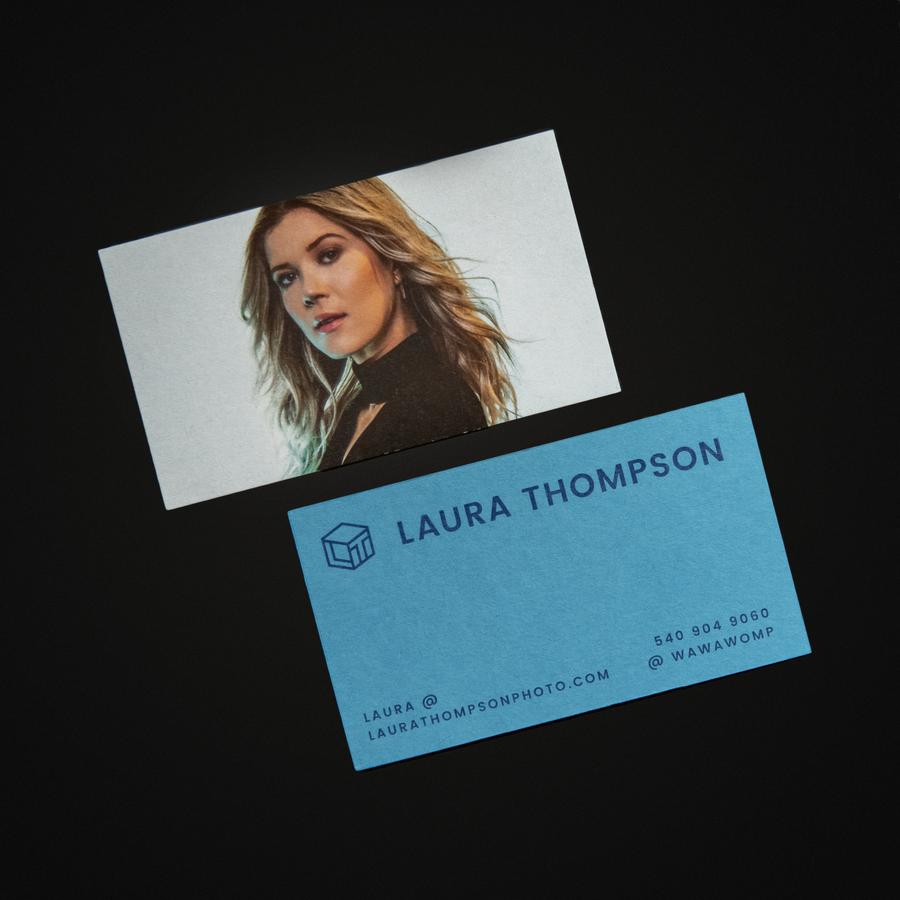
This brand was created with a wide color scheme based on bright primary colors in duo-tones to mix and match, optical illusion-inspired patterns, and unfussy typography to stand out from the standard “Didot font, white background” premium photography brand. Can you tell she’s a Gemini? Visit her site.
This brand was created with a wide color scheme based on bright primary colors in duo-tones to mix and match, optical illusion-inspired patterns, and unfussy typography to stand out from the standard “Didot font, white background” premium photography brand. Can you tell she’s a Gemini? Visit her site.
—Branding
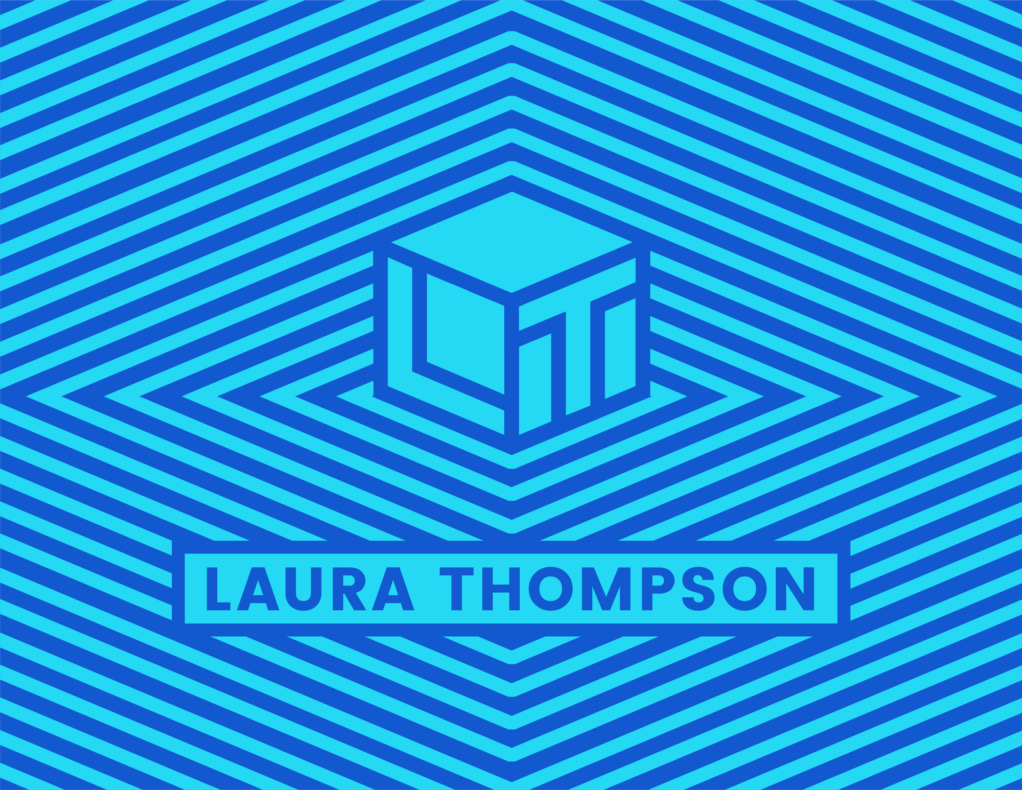
—Logo


“I started to work with Sharon when I was still cobbling together what I needed as I needed it. I was at a point where I needed intervention to solidify what my brand looked like...”
Sharon took what I had in mind and came up with clean, professional solutions that felt like a natural “next step” for my business. Now, I don’t have to spend time rushing new color schemes and typography on different platforms anymore.
I was told by a major media company that I almost look almost too organized and expensive for them to work with! I have also seen fewer clients ask for discounts or try to take advantage of my time.
Since I started incorporating her assets into my website, social media, invoices, etc. brand recognition has improved and I’m ending the year in a much stronger place than where I started.”
—Laura Thompson, Photographer